Choosing can be confusing
A blind women (who we will call Sheena), while completing her manicure, was asked to choose the polish color she preferred. Being unable to make the selection on her own, she turned to a fellow patron and asked; “Which color do you prefer? Ballet Slippers or Adorable”? “Definitely the Ballet Slippers” the woman replied. “Why”? Sheena inquired. “Because it’s elegant,” the patron responded.
Getting the attention of another patron, Sheena asked; what color would you choose? “Without a doubt; Adorable,” she replied. Why? Sheena again inquired. “Because it’s glamorous” the woman responded.
Hmm, we have; elegant and we have glamorous. What do we choose? Being a research analysis and a professor at Columbia University, (for kicks and grins) Sheena decided to test the results on her own. What she discovered was 50% (when hiding the label) of the women she tested accused her of trying to trick them by filling two bottles with the same color. Go figure! http://www.ted.com/talks/sheena_iyengar_on_the_art_of_choosing
More choices, the better…really?
When it comes to making choices it is often confusing. If choosing between A and B is confusing, imagine the level of complexity that one experiences when they are confronted with choosing between many possibilities.

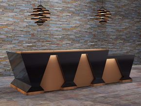
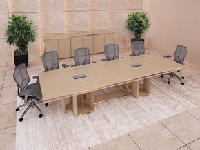
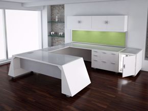
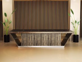
That is an area that we at 90degreeofficefurniture are well familiar with for a couple of reasons. It seems as though clients visiting our website for the first time (for reason number one) have less than a definitive idea of what modern reception desk they are looking for, for their entryway. With that, the preponderance of people shopping for modern reception area furniture or design possibilities online is looking for something that strikes their fancy, when they see it, they will know it, they say. Secondly, because we offer so many choices of colors, materials and shapes, it often adds to design uncertainty.
Struggling with office reception area design? You are not alone
When it comes to making choices about one’s reception area at their workplace, we have found some people struggle because either they don’t understand the fundamental differences from one design to another or between one product and another as it relates to desired outcome.
“The value of choice depends upon our ability to see and understand differences”
Keys to planning office reception area outcomes
The first component in making the best reception area choice for you brand is beginning with the end in mind, “desired outcome.” That component negates the whole “know it when I see it” approach that we talked about earlier. Beginning with a desired outcome in mind puts you in a better position to make effective choices, as opposed to random.
One way to derive at an effective design concept for your brand is by writing a list of all the things you want your brand to communicate and choosing the top three, we find makes a good place to start.
For example; if you are a health food company you might choose these three: “Natural, Quality, and long life.” From this, the question is what elements will best communicate these attributes to “your” environment?
By making a list of all the elements that most people will think of that will best communicate those brand features is a way to nail down design elements with possibility. An example of this could be materials provided by nature i.e. natural wood, water, vegetation etc. Quality on the other hand can be reflected by having quality pieces of furniture and appointments. Conversely, having low quality visuals is in direct contravention to your stated desires. Then there is long life; images of healthy, actively aging people, books and magazines on health and active life styles, to name a few.
More keys to office reception area design
Color is another area of design communication that instantly communicates a feeling. Understanding how color in your reception area works is another great thing to consider. Going back to the example above; consider using colors provided by nature as formidable communication agent.
This article is not intended to answer all your design questions, but rather to give you some starting ideas as to how to choose design ideas for your reception area that communicate your branding ideas. However, if you need additional ideas for your specific branding needs, feel free to call or email us: 855-699-3034 or [email protected]
In America, we all seem to prefer choices because it seems to relate to freedom. Having more choices the better, we think. “However choosing can be frustrating when thrust upon those that are insufficiently prepared.” http://sheenaiyengar.com/
Unfortunately, when it comes to business, the choices we make about how and what our brands communicates with customers and the surrounding people that support it, matters. How people “feel” when experiencing the brand makes the difference between support and abandonment.
Perhaps, your reception area design will not make the difference as to whether customers buy from you or not, but it will certainly make the difference as to brand consistency.
At 90degreeofficefurniture we have found designs that communicate a message that connects with what the audience wants, needs or finds attractive for their own reasons are the brands that do well.
It does not matter if the choices we make for our brand are small or great, every choice we make, defines the company and in some way shape’s the business and the way people think about the brand.
By: Bernie Fairchild


